A promotion package for the release of an album, to include a music
promo video, together with two of the following three options:
a website homepage for the band- a cover for its release as part of a digipak (CD/DVD package)
- a magazine advertisement for the digipak (CD/DVD package)
In what ways does your media product use, develop or challenge
forms and conventions of real media products?
Before I started to make my music video I researched existing
music videos from the same genre of folk/indie rock in order to give myself a
better idea of what codes and conventions I needed to recreate. These existing
media texts include Mumford & Sons and Laura Marling. I chose these two
artists especially because my chosen song is a Mumford and Sons song, but is a
cover by Taylor Swift. Laura Marling is also a music artist belonging to the
genre of folk, whereas Taylor Swift is a country/pop singer – therefore music
videos of Laura Marling were more suitable. But I did look at the original performance of the cover by Taylor Swift.
From this research I established what the codes and conventions
are of my chosen genre.
- Little Lion Man by Mumford & Sons
- Rambling Man by Laura Marling
- 5 Years Time by Noah & The Whale
- L.I.F.E.G.O.E.S.O.N. by Noah & The Whale
- The Box by Johnny Flynn
Music videos within the
genre of folk/alternative rock are typically performance and/or narrative. All
of the example texts that I looked at included the artist within the video,
whether it was just them performing or alongside a narrative. The artists are
represented as enjoying music itself and performing music. The audience of
folk/alternative indie rock are likely to be people who enjoy live music and
are likely to have a high disposable income in order to pay for downloads,
albums and concert tickets etc.
In terms of cinematography
they generally use close-ups for the artists and showing them playing an
instrument, which is also closely associated with this genre, especially the
lead singer within a band. Within the videos using a narrative alongside the
performance, especially in the Laura Marling video, the main point of focus
still remains to be the artist, the audience aren’t can’t be sure who the man
in her video is and what his purpose is. Within the music videos for bands they
use an establishing shot / ELS either before or when they start to sing, so
that the audience know what they are actually watching – within the Mumford
& Sons video it isn’t clear what is going on, because there are cuts
between different instruments and it isn't clear where they are situated until
the establishing shot. I think that this creates suspense among the audience
members to sell it to them, so that they keep watching the video to see what
they think of the artist. A Music video is essentially an advertisement for a
song; it is selling the product and the brand, being the artist, as a way of
earning money. There isn't a lot of movement from the camera other than the use
of steadicam following the characters within the narrative sequence. Long shots
also give the audience a better picture of what is going on, these are more
typically used within the narrative style. POS shots following an eyeline match
show the audience what the characters are doing within the narrative, or could
be used to show the use of an instrument. An ELS within one of the videos shows
the audience participating in the artist’s performance by clapping, following
this a pan is used to show the audience and then pans back round to the band
afterwards. A crane is used as a movement technique to show the audience whilst
they are performing, this is a convention of a performance, not the narrative
side of it. Reverse zoom is used to transition the camera from a close up, for
example a member of the band, and then show them in a mid shot playing their
instrument. Focus pulls are used to switch from out-of-focus to focus in on the
lead singer, as he starts to sing. This technique really draws in the
audience’s attention.
There aren't many fancy
editing techniques used within this genre of music, especially because some
videos don't have a narrative alongside them. Rhythmic editing is used to keep
the pace of the video in time with the music, and within the Mumford & Sons
example jump cuts are used to switch between the close-ups of the instruments
and band members along with the beat of the music. Within a video which
contains a narrative, crosscutting is used throughout to show the artist
singing and the narrative which she is singing about. Eyeline matches are used
along with crosscutting between the singing and the story which they are
singing about, because it is as if they are telling you a story.
Within the aspect of
Mise-en-Scene, the lighting is a key factor because it creates shadows and dark
areas which disguise the artists’ faces many times and you can't always see
them clearly, at points there is more focus towards their instruments. In parts
of the videos the lighting fits to the beat of the music, henceforth
accentuating the beat of the song. In terms of setting, costume and location,
within this genre it is more music focused and therefore everything is fairly
basic with nothing too fancy. It is just mainly focused on the artist and their
instrument. Within the Mumford & Sons video it looks as though it could be
set in a barn and this has typical associations with folk/country music. In
terms of their clothing there is again nothing too fancy the colours used are
fairly neutral, which doesn't pull any extra focus to them suggesting it is
more about the music. In the Laura Marling video the man and the artist are
both seen wearing winter clothing, such as a big coat and then towards the end
of the video the man goes into the sea this contrasts completely from what we
have already seen suggesting he is a bit mad.
The sound featured within
these videos is synchronous diegetic sound including the music and the singing,
but within the videos which feature a narrative the sound is partially diegetic
synchronous and partly asynchronous. Due to the fact there are times when you
can't see the artist singing but the audience know where the sound is coming
from. Also within narrative videos there are sounds coming from the characters
involved within a scene for example in the Laura Marling video when the man is
coming out of the sea with a suitcase and you can hear him gasping for breath
and the noise of the sea, this is also synchronous diegetic. Some of the videos
start off by showing the narrative rather than the artist first so any sound of
the track would be asynchronous diegetic and then becomes synchronous when we
see the artist and continues to switch between the two as we see the
performance and the narrative.
The form of the music
videos within the genre of folk/alternative rock are mainly performance. For
example within my model texts they are within a studio-like setting or just the
artist and their instruments some also clips of live footage of the band whilst
they were on tour. The narrative in the Laura Marling video follows the
rambling man as he goes to the beach, and the video also shows a performance
from Laura Marling with her guitar. The Box by Johnny Flynn is quite
unusual because it contains the drawings of a man along with a
performance of the song by Johnny Flynn. Text also appears on the screen as the
lyrics are sung in some parts.
My music video fits within many of the codes and conventions of music videos of its genre. My music video is within the form of performance, thus fitting with the codes and conventions of my chosen genre. For example the Mumford & Sons' music video are entirely performance. The Laura Marling video is both performance and narrative - I think the fact that my video includes shots of New York creates part of a narrative of reminiscing. These images below are example of shots within existing music videos.


These images are a close up of a guitar and then a close up of a piano, similar shots to this are used very frequently within music videos belonging to the genre of folk indie rock. I think they choose to use such shots to show their dedication to the it music and that they are original, not just doing it for the fame.

This is a crane shot of the audience, these shots are used within a music video which contains a performance by the artist. The shot shows the audience enjoying themselves, which makes the audience of the music video want to enjoy the artist in the same way, thus selling the product of the band.

This image shows a close up of band member, I have this shot because I like the way the lighting has been used so that all you can see is the silhouette of his face. During the filming of my music video I would like to experiment with lighting to see what different effects can be created. For example if the artist is back lit it can represent the artist as being mysterious and sinister, whereas if they are front lit it makes the image my flat. Also if the artist is side lit, it can create a similar effect to the above image.

This image is a long shot of a band and this shot also acts as an establishing shot to show the location. Shots like this are common within music videos in between close up shots of each band member. The shot also shows all the instruments, which consequently gives the audience a clue to what they are about.

 These above images show extreme long shots and establishing shots, I like the effect that the sun set creates - a poetic scene. This image is something I might think about taking inspiration from, it looks good to the viewer and it's not something you see everyday.

These images show a close up and then a mid shot of a band member these are typically used within a band's music video, if the video is in the from of performance. It shows the audience where the music is coming from, making the sound synchronous unlike that of a narrative or abstract music video.

This image shows a close up of a band member's feet, the old barn-like location gives it a rustic feel. It also makes the music seem more raw, as though there isn't anything superficial or imposed through special effects etc.

This image shows a close up of the solo artist, I like this because it is set within a recording studio environment. There isn't anything superficial about it, it's just the artist singing with her guitar.

The above image shows an close up of the guitar, which I think could be used within an eye line match from the artist looking down to see her guitar. Shots of instruments are typical of folk/indie rock music videos.
 This image shows a shallow focus pull, to the foreground of the artist. I like this it shows a way to focus on the background and then the foreground within one shot. Also it establishes the setting from something you can't see completely clearly to the artist.
The above image shows a medium close up of the solo artist, this is very common within a music video belonging to the genre of folk/indie rock.


 These three images are stills taken from the filming that I have done inside. I think because it is so dark that it doesn't work very well. I want my scenes to be well lit as it looks more professional. But I do like the close-up shot at the bottom, which highlights the artist and her facial expression. They relate to the images taken from the existing music videos, because they show a variety of shots including a close-up and a medium close-up of the performer. I chose to use close-ups as they show more emotion of the performer


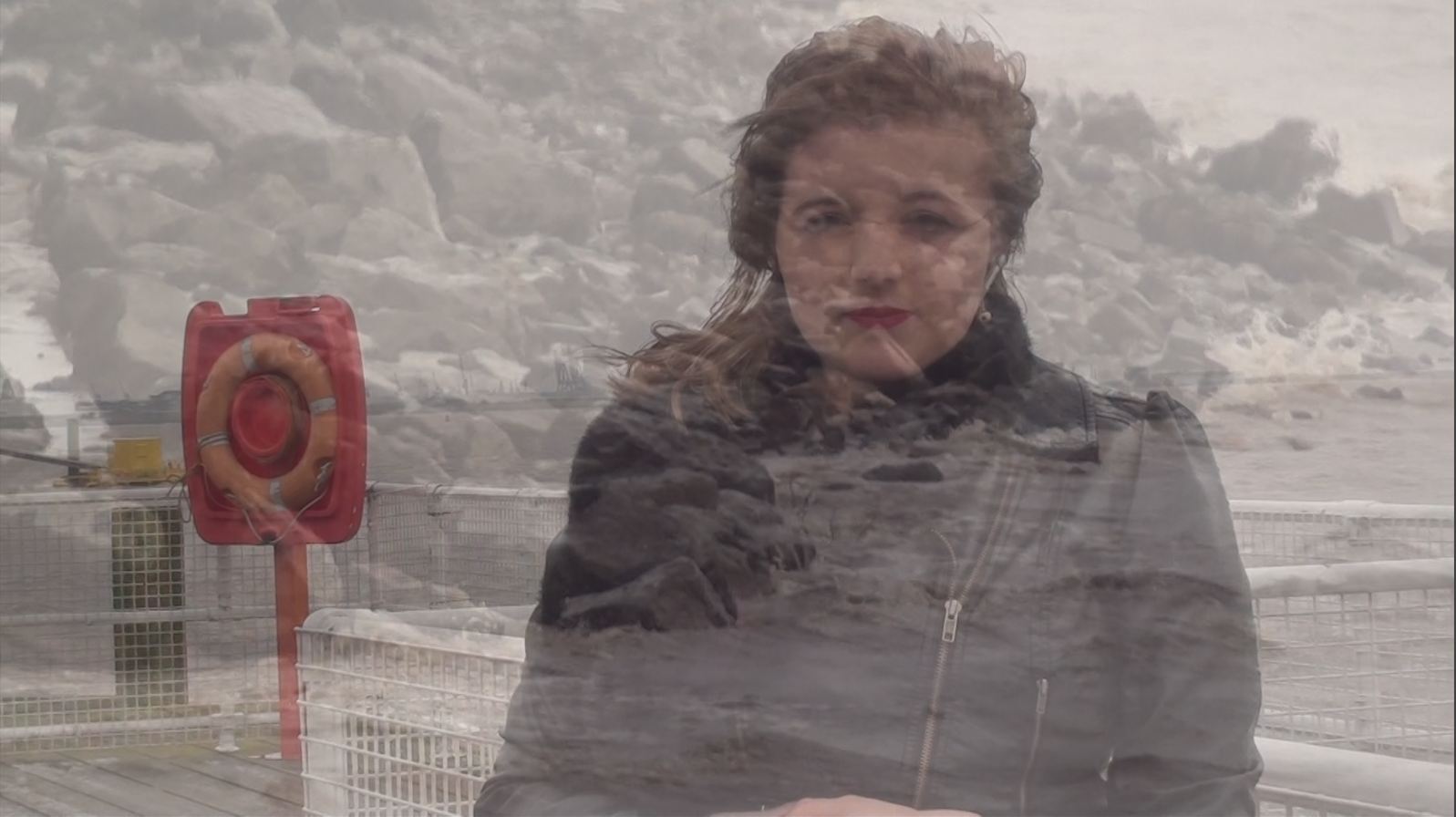
The four images above are stills from some more filming that I did this time outside. This filming was done at the pier in Hull, but on the day there was very bad weather as it was raining and very windy - but we carried on filming regardless. It was quite disheartening to go out and find that there was bad weather - as we had been planning this for a while and was the only day both I and my actress had free. I chose this location after watching Laura Marling's Rambling Man music video - and the performance element of her video inspired this footage. The above stills taken from some of my filming are not quite what I wanted in terms of meeting the codes of conventions of my chosen genre - because I use a long shot of the building in the background and then zoom in and my character remains to be seen in a mid-shot. The first three images aren't technical successful, because there is a lot of wasted space surrounding my actress, when according to the rule of thirds the main focus of the audience ought to be in the centre, which she is in the fourth still. From doing the filming I have learnt how hard it is to think about all the elements of a media text yourself, as the director you must think about how and what the cinematography and mise-en-scene are communicating to the audience.


The above images are stills from my video, between each video of footage I added transitions. Mostly I used a cross dissolve and another type of dissolve, I used them to keep with the established code of folk music video editing - I used rhythmic editing. This means that my music video footage goes with the changes in the music rather than changing due to narrative or something else. I enhanced it with the transitions, because the music is calm and slow so cutting between each shot wouldn't be suitable.

My music video uses medium close-ups of the artist (like the above image) to show some feeling whilst she is singing the song. This type of shot also fits with the codes and conventions of videos of my chosen genre. Such as Laura Marling's Rambling Man when she is stood on the beach or the videos that I looked at which show the band member's in MCU when they are performing.

The above snippet taken from my music video shows a long shot, which acts as an establishing shots in order to
communicate to the audience the location of the performer. When she is singing in the park, at the pier and in her bedroom - I chose these locations as they are quite generic and could literally be anywhere including New York City like the video suggests.
In terms of sound my video fits with the codes and conventions already established, as it uses synchronous diegetic sound. This is through the performer, who the audience can see are singing - thus making it synchronous. At times in the video there are shots of New York and she is still singing which makes it asynchronous. Also during the shots of New York it is also non-diegetic sound as it was added in during post-production. The actual music itself is asynchronous throughtout the video because you cannot see the instruments being played, this breaks the codes and conventions of my chosen genre. In a majority of folk / indie videos at some point you will see the artist playing an instrument, which you don't see in my video. I had planned to include footage of someone playing a guitar but due to time restraints I never got round to filming that.

The above image shows my magazine advertisement next to an existing magazine advertisement and how both display the codes and conventions of the media text. Both adverts include the artist's name and the title of the album, which informs the audience of the product. They both feature a release date which also informs the potential consumer of when they can buy this product. There is also a main image on both of the adverts of the artist which also acts as a way of selling the product. A majority of the time, although the are selling a product they use the image of someone in order to do that. And this uses the image of the artist to do this, as it will appeal to already established fans and potentials new fans, if they like the look of them. My advert also includes a quote from a music magazine and a rating out of five. I added in this feature, because it can potentially make a product sell more, as it acts as an opinion from authority and people trust what the music magazine writers are saying. I chose to quote it from Q magazine after researching what music magazine covers Mumford & Sons have been on. When you cite the source of the quote it can make it appeal to reader s of that magazine as well, thus potentially making it sell more. Both adverts also feature extra information including the artist's website address. This allows the reader of the magazine and potentially consumer of the album to go online and look at the artist. There will also probably be snippets of the music that you can listen to, effectively allowing you to try before you buy.

The above image shows my digipak next to an existing digipak and how both display the codes and conventions of the media text. Both digipaks include the artist's name and the title of the album, which informs the audience of the product (this is on both the front cover and the spine of the product.) There is also a main image on both of the adverts of the artist which also acts as a way of selling the product. A majority of the time, although the are selling a product they use the image of someone in order to do that. And this uses the image of the artist to do this, as it will appeal to already established fans and potentials new fans, if they like the look of them. On the back cover of the album there is a track list of all the songs that feature on the album. Both digipaks also feature a barcode, which is typical of any product that you can buy. But my digipak also features a QR code, which is typical of products in 2013 - it allows people who have a smartphone to scan the QR code and instantly gain access to a webpage or acts like a barcode so you buy it online through internet 3G. I added this in because is a modern feature and reflects how technology can develop over a short space of time and it makes the product more accessible.


Both digipaks also feature extra information including the artist's website address. This allows the consumer to go online and look at the artist. Here they can purchase merchandise, live tickets and possibly access exclusive content. Within the extra information there is also legal information including copyright information - which I copied the style of from the back of a real album. I also included the Copy Control logo and the record label's logo in order to make my digipak look more realistic. All these features are in keeping with the established codes and conventions of a digipak, as they are all elements that I have seen on an existing digipak and they have then inspired the style of mine.
How effective is the combination of your main product and
ancillary texts?
I have created a music video promo, a digipak and a magazine advert in support of its release. I attempted to create an effective combination between all three products by giving them shared elements for example the font 'rage italic' which is used across both my magazine advert and my digipak. This font was used for the main pieces of text and I used TW Cen MT Condensed for the smaller pieces of text. I chose two different fonts because rage italic is harder to read in a smaller size due to its element of serifs. TW Cen MT Condensed is a sans serif font, which I have used for the legal information and other small print texts, because it is easy to read. Another shared element of my three products is the colour yellow, which features in my video and the back cover of my digipak in the form of a New York taxi cab. The colour of yellow also creates a shared element across my magazine advert and my digipak due the colour of the font. This is used on the front and spine of my digipak and the main text on my magazine advert in the form of the artist's name. I chose to use the colour of yellow because it is eye-catching and draws in the attention of the audience. The theme of New York is also visible within the digipak and the the music video, through the use of footage and images taken in New York City. I chose to use this as a location as it very well known and that is where successful artists shoot their music videos. It is also a relevant city in terms of the music industry two of the three major record labels, Sony Music Entertainment and Warner Music Group, have their Headquarters in New York City.

L – "Sophia MacGowan" tells the audience the name of the artist, I chose to put it in a large font in bright yellow, so that it will stand out to the audience and readers of the magazine. The title of the album "Sigh No More" is the same font as the artist's name - rage italic - to maintain continuity.
I – The digipak is by artist Sophia MacGowan and it is produced by Island Records - arguably the most prestigious record label in the history of British music.
I – This digipak is representing Sophia MacGowan's music. It is a product which sells her music and therefore represents the values and ideals that she has.
A – The target audience is women aged 16 – 25, mainly students.
R – It represents Sophia MacGowan as being feminine and elegant. Through the use of the black and white pictures, which connote the past i.e. like an old Hollywood movie.
 |
| Before |
 |
| After |
In order to create my digipak, I opened up the digipak template in Adobe Photoshop CS5. I then opened up my first image in photoshop, that I want to use for the back cover of my digipak. I then edited the image to make it look more professional and eye-catching. I did this by enhancing certain colours of the image. (See above.) I then copy the picture and pasted it on my template and edit>scale>transform so that it would fit in the box of the back cover image. I also had to crop the image slightly to make it fit to the size of the template. Then I added text to the back cover in the form of a track list. This is how the image looks in the context of the whole digipak. I then opened up my second image in photoshop, this will be used for the top right image of the digipak. I then edited the colour of the image so that it was black and white - in order to create a vintage feel of the product. And black and white creates a reference to the past which reflects how the artist feels about New York. I then copied the image onto my template and then had to scale it down to fit into the box for that image of the digipak. I then rotated the image 180 degrees, because when it is printed that will be folded over for the other side of the digipak. I then opened up my third chosen image in photoshop, I changed the colour of this image as well so that it is black and white to create continuity with the other images. I scaled my third image down to fit into its respective place, I also had to crop the image using the rectangular marquee tool. I also had to rotate this image 180 degrees so that it was the right way round for the other side of the digipak. I opened up a new image in photoshop which will be used for the bottom left image, which I have chosen to split into four separate sections. I then changed the colour of the image to black and white to maintain continuity between the images and then copied and pasted it onto my template. I scaled my image down to fit into approximately a quarter of the bottom left image. So that there is room for three more images.

I then opened up another image in photoshop again for the bottom left image of my digipak. I edited the image to make it black and white to maintain continuity throughout. I then copied and pasted the image and scaled it to fit to about a quarter of that side of the digipak. I opened up a further image in photoshop and edited the image so that it is black and white to maintain continuity throughout the images. I then copied and pasted the image onto my template and scaled and cropped it to fit into approximately a quarter of the square. I opened my final image for the bottom left corner of my digipak and also edited the image so that it is black and white, thus maintaining the continuity with my other images. I then scaled down and cropped the final image to fit into the last quarter of the bottom left corner. The image (see above left) shows the bottom left section with all four images on it. And I have now added two black panels where the spines of the digipak are. I opened up a new image in photoshop of the typical New York yellow cab, which has already been cropped to just show the registration plates and the bottom half of the cabs. I will crop it to the size of the spine. The above image shows the images of the New York cabs cropped to fit the shape of both of the spines. I then edited the images of the New York cab so that they were black and white like the rest of the digipak - thus maintaining continuity and the style that I have created. I then added text to my spine in the form of an album title and a artist name, this informs the consumer of what they are buying when CDs are stacked. After I added the artist and album information I added a logo of Island Records to make the digipak look more realistic. I chose Island Records because Mumford & Sons are under that label - so it is extremely likely that my artist could get a record deal with them. I then opened up a new image in photoshop for my front cover. I edited her face using the spot healing brush tool. And then copied it and pasted it on my template. I cropped and scaled down my image to make it fit into the space allocated for the front cover image. I then added in a album title and a name for the artist. I used the same font that I used for the text on the spine - rage italic - in order to maintain continuity.

I opened my final image in photoshop, which I then edited with the spot healing brush tool. I used this tool to get rid of any spots in order to make the image look professional. I then copied it and pasted it onto my template. I scaled / cropped my image so that it would fit into the allocated space for the top centre image. I then edited the image again to make it black and white. I also rotated the image 180 degrees so that it is in the right place when it is printed out and folded over.

L – "Sophia MacGowan" tells the audience the name of the artist, I chose to put it in a large font in bright yellow, so that it will stand out to the audience and readers of the magazine. The title of the album "Sigh No More" is the same font as the artist's name - rage italic - to maintain continuity. I also added 5 stars as a 'peer review' and made the stars yellow so that there is another element of the magazine advert in yellow.
I – I think this advert will be bought and published by women's magazines and music magazines. After I completed my magazine advert, I printed it out and placed it in a magazine so that I would know what it would look like in reality. (see below left) An ad of this size would cost £17,807 to be published in Marie Claire. Whereas in Q magazine it would be £10,072 - plus 72% of their readership are ABC1 with a high disposable income, which means it is probable that they will buy what they see advertised in a magazine, as it is supported by the publication they chose to buy. But Q has a 70% male / 30% female circulation, and my product is aimed at mainly women, so it might be a better idea to advertise around Christmas when they are likely to buy something for their mum, wife or girlfriend.

I – This product aims to sell the digipak of Sophia MacGowan. I used a 'peer review' as a way of persuading my audience to buy the product.
A – The target audience of this magazine advert is mainly a female orientated one. They are also mainly 16 - 24, students who are interested in music and seeing live music.
R – It represents Sophia MacGowan as being an elegant woman and also depicts a serious side of her music. It has a romantic theme to it; due to the pearls, the curls in her hair and the serif font. Plus the image is in black and white, which represents the past.

In order to create my magazine advert, I opened up a new template in Adobe Photoshop CS5 for an A4 piece. I then copied the already edited image of my artist from the front cover of my digipak. I chose to use this as my main image for the magazine advert. I left a blank white space at the bottom so that I can add information about the album underneath the image. I then added a black line to separate the advert between the image and the information. I then added the album title in the same font as the digipak - rage italic. I added 'OUT NOW' all in caps to make it stand out and highlight to the audience that they are able to buy it now. I added in other information underneath, such as where they can get the album from and the artist's web page. This gives the consumer more information on where to find information on the artist and this is a typical convention of magazine adverts for any product.

I then added a quote and a rating from a magazine, because this is a typical convention of media product advertisements. I decided to change the colour of the text and the background - this allowed me to maintain some continuity with the digipak and get some colouring on my magazine advert as well. I changed the quote from the existing music magazine slightly to make it flow better. I also added in a white line between the main image and the information to hide the crossover between the two. After looking at some more existing adverts I decided to add an extra star to really make it sell. I also made the text box containing the extra information bigger so that it all sits on one line for each sentence.


I used the same image from the front cover of my digipak for the main image on my magazine advertisement. The other image is the back cover of my digipak, it features a track list in the font rage italic which I have maintained throughout my digipak and advert. I think that to possibly improve the cross-form synergy between all three products I could have used a still image from my video in my digipak - possibly the front cover which could then be the main image of my magazine advert. Or I could have had an alternate image for the main image of my advert, then had a smaller image of the digipak cover in order to make a reference to it. This would also combine all three products nicely.
What have you learned from your audience feedback?
In order to gain audience feedback I put together a questionnaire, which consists of many questions that cover all three products that I have made. They were the following questions:
Are you Male or Female?
How old are you?
10 - 15 15
- 17 18 - 20 20+
After watching the music video I have made what do
you think the narrative (story) of the music video?
……………………………………………………………………………………………………...........
Do you think the music video reflects the lyrics of
the song?
Yes No
What genre do you think the music video is?
Pop Dance Folk Indie
Rock R&B
Did you enjoy watching the music video?
Yes No
What would you change about the music video?
…………………………………………………………………………………………………………...
What do you think about the artist’s performance?
…………………………………………………………………………………………………………...
Would you buy the music video on itunes?
Yes No
After looking at my Digipak do you think it
reflects the music video and the song?
Yes No
Do you think this looks like a real Digipak?
Yes No
If there is anything, what would you change about
the Digipak?
…………………………………………………………………………………………………………...
What do you like most about the Digipak?
…………………………………………………………………………………………………………...
Can you tell what genre the music is from the
Digipak?
Yes No
Does the magazine advertisement include all of the
information you would need?
Yes No
If not, what is missing?
…………………………………………………………………………………………………………...
Does this look like a real magazine advertisement
for a new music album?
Yes No
Can you tell what genre the music is from this
advertisement?
Yes No
What do you like most about the magazine
advertisement?
…………………………………………………………………………………………………………...
Do the music video, Digipak and magazine
advertisement all show continuity and reflect each other?
Yes No
From these questionnaires I gained an unbiased opinion on my music video, digipak and magazine advert. I took some of my answered questionnaires and turned them into an animation.
Animated Presentations - Powered by GoAnimate.
Video Maker - Powered by GoAnimate.
Video Maker - Powered by GoAnimate.


A majority of the comments from these questionnaires were positive. I mainly asked my target audience of females aged 18 - 20. They understood that the narrative was about a girl singing and reminiscing about her past who is upset and has suffered heartache and the scenery of New York reminds her of that time. But personally, from a critical perspective, I thought the narrative could have been explained in a better way as I find it fairly unclear. A majority of the people questioned also thought that the video reflected the song lyrics. A majority of people understood that the video was within the genre of folk, but some did think it was pop. I think this confusion came from the fact that the track I chose to use was sung by pop artist Taylor Swift. All of those questioned said they enjoyed watching the music video. And when I asked what changes you would make to the video I got a variety of answers. These included how the performer in the music video needs to mouth the words more clearly. Someone else said there should be more happening i.e. more scenes and shots and possibly even another character aside from the artist. Another person suggested more moving shots so the main character isn't always stationary. Another person suggested there should be less shots of her singing and more shots of New York. Someone else thought a wider variety of shots was the most important thing to include such as high / low angle, close-up, medium close-up etc. and also the narrative could be clearer. Another commented on how the video was, therefore it really needed a variety of shots. From this audience feedback it has reinforced what I already thought about my music video. I knew that the song was really long at approx. 5 minutes which made it even harder to include such a wide variety of shots, angles and characters. Due to this problem after a short amount of time the video becomes rather boring and repetitive.
People were also very positive about my ancillary texts saying that it does look like a realistic digipak and magazine advert. The main issue with my ancillary texts is that they commented that they couldn't tell what genre of music it is from the digipak / magazine advert. One person suggested that although the video looks more folk / indie rock the ancillary texts look like they are reflective of a pop music video. But aside from this all those questioned agreed that all three texts together show continuity. Mainly through the use of New York as a location and the colour yellow. From these comments I have thought about about how I possibly did not think about the codes and conventions of each specific genre of a digipak and a magazine advert, as on a whole they have mainly the same features throughout all genres e.g. artist name, album title and the main image of the artist.


 I also used a poll gadget on my blog in order to find out more about my intended audience. From this poll I found out that 89% of my audience are aged between 16 - 24 years, which matches my target audience of people who are around the age of students. They are also 78% female, I think this is mainly because it is a female audience, because the artist is also female and she also writes her songs about her on personal experiences which makes it easier for women to relate to her music rather than men. 67% of my target audience live in the city compared with 33% who live in the nearby suburbs. And even though there was a wide choice of genres to choose from in my poll, 12 to be exact, indie came out as the most favourable with 18% followed by rock with 15%.
I also looked created some psychographic audience profiles, view-able here.
I got some people together, who I thought fitted the criteria of my target audience and played them my chosen song and then asked them some questions, including:
- What do you think of this song?
- This song doesn't yet have a music video, but what do you imagine the music video will look like?
- Also considering my influential media texts, what do you expect to be in the video?
- What would you expect the video form to be; narrative, performance,abstract or animated?
- What sort of costume would you expect?
- What camera shots would you expect to see?
- What editing techniques would you expect to see?
From these interviews I got more ideas of what to include in my music video. The first video was shot when I thought I was going to use a different song to what I am doing now, but it gave me the idea of shooting it the narrative a bit like a home movie. The other two videos were shot when I was planning on using the Awake My Soul by Mumford & Sons, whereas I am now using White Blank Page originally by Mumford & Sons, but I am using the cover by Taylor Swift. My audience also suggested close ups of the artist and the instruments used. They also suggested casual clothing and nothing too fancy, along with fairy lights to create a warm image. One suggested the video should have a country feel to it and be shot outside. I am firmly convinced now, after completing my Advanced Portfolio, that I would do things differently if I were to do it again in the future or if I were to go back and change something. I have definitely learnt from the experience. I now know how hard it is to create a realistic and professional looking music video, I can also appreciate the amount of hard work that goes into it.

This is a representation of my demographic audience, I created this poster as a way of displaying my findings all together in one place.
From creating my foundation portfolio to moving on to create my advanced portfolio, I have developed skills for using the specific software which enables me to create a professional looking piece of work. I am now more able to look at existing media texts and take inspiration from them, by analysing them and considering what sort of an audience they would be suitable for. For my advanced portfolio I will need to consider the codes and conventions of my chosen brief, creating a music video, to help me with the creative process. I have now learnt how to implement typical conventions into my work while still making it original. Also going through the conventions is part of my research and planning and I have also developed skills on how to use the technology to display my research such as Prezi.
After I chose my brief I did some research into the artist and found out a bit more about their background and their music. I used Prezi in order to bring together information that I had found out about Mumford & Sons. I used Prezi as a way of presenting this information and bringing together, the advantages of using Prezi is that I can bring together images, videos and text. Prezi allows you to embed videos from YouTube and insert images to collate a thorough presentation. Another benefit of using it is that you can embed it to an online blog and then share it with people in many ways. Due to the fact that it is stored on the internet, you can access it anywhere.
The research contributed to my product as it helped me to establish the codes and conventions of my chosen genre. I also found the lyrics online and printed out a copy in order to analyse them to give me an idea of what the song represents. I also printed out another copy of the lyrics to time how long each line was. This helped me to complete the storyboard and then the animatic. Both of these planning processes helped to give me a clearer view of what I needed to do.


I looked at an existing music video and completed a storyboard of the first 30 seconds. By doing this exercise I established how many shots there are in a real music video. I realised the variety of shots involved. After this I also completed a deconstruction and reconstruction of a music video. This involved working in groups making a storyboard and looking specifically at all the shots used and to then go out and recreate the 30 second excerpt. Through this exercise I realised the hard work that goes into creating a good music video. By working as a group the work load was split between the five of us. I wasn't present at the filming, due to prior commitments, so I don't know what went into to making the filming go right. I did more in the way of editing, so I know that it was hard to get it in sync. At times I used the razor tool to chop up footage then use the rate stretch tool to speed up or slow down a specific part of the footage accordingly so it would fit with the lip-syncing of the artist in the film.
For my Foundation Portfolio I created the front cover, contents page, and double page spread of a new music magazine. Whereas for my advanced portfolio I had to create a music promo video, a digipak and a magazine advert to support its release. Both of the portfolios required all of the images and text to be original and produced by myself. I chose to create my music magazine within the genre of jazz. Also for my foundation portfolio I needed to complete a preliminary exercise. I produced the front page of a new school/college magazine, featuring a photograph of a student in medium close-up plus some appropriately laid-out text and a masthead using desktop publishing and an image manipulation program. Additionally I produced a mock-up of the layout of the contents page to demonstrate my grasp of DTP. For my advanced portfolio I had to use skills I had already gained from the foundation portfolio using a desktop publisher for the magazine advert and the digipak. But the music video itself had to be produced on video editing software and I used Adobe Premiere Pro CS6. It is a non-linear editing system.
 |
| rate stretch tool |
 |
| razor tool |
In my foundation portfolio I used Adobe Photoshop CS5 in order to manipulate my photos to have the desired effect and make the publication look more professional. I had used the software briefly before in a previous project, other than that it was completely new to me and I had to learn how to use it. Abobe Photoshop CS5 allowed me to edit my digital photos to a high standard, but my main technical challenge was learning which tools to use to create which effect. Also creating a photo which would allow space for the typical conventions of a music magazine such as a masthead, main feature headline, dateline, barcode, issue no, skyline and subtitle. In order to achieve a professional looking magazine along with all the typical conventions I took photos and then tested them out on Photoshop by adding all the elements and seeing if it worked. Following this I would take some more photos with the layout of a typical magazine in mind in order to achieve the desired result. By creating a magazine front cover with all the typical conventions I was able to communicate to the audience that publication was a professional one, i.e. something worth buying. For example I used certain tools within Adobe Photoshop CS5 like the Gaussian blur tool to make my model’s skin look flawless, the way in which professional publications make it look. The blur tool enabled me to edit my photo and enhance my model’s skin. I adjusted the Gaussian blur to a suitable level so that I could still see the outline of her silhouette, but the skin appeared softer and completely unblemished due to the blurring of the skin tone, because it becomes less grainy and more porcelain. I then added a layer to the duplicate layer to allow me to edit the eyes, mouth and other features. Then I used the brush tool to erase away the blurriness around the key features. I also used Adobe Photoshop with my advanced portfolio in order to create the digipak and the music magazine, the difference between the two was the weighting of the products for the final marks. My images that I used were mainly landscape images of New York or of landmarks in New York. But some of the images were In the foundation the magazine front cover, contents page and double page spread was the main part of the portfolio, whereas with the advanced it was a minor part of it. This difference stresses the importance of using the skills that I had gained last year towards my advanced portfolio. I had to spend a majority of my time producing the music video.
I had similar problems with my advanced portfolio that I had with my foundation portfolio, especially the fact that I wasn't familiar with the software that I had to use. I found the main challenge, that I couldn't quite grasp the amount of footage and the variety of shots that are needed in order to create a realistic music video.
I had similar problems with my advanced portfolio that I had with my foundation portfolio, especially the fact that I wasn't familiar with the software that I had to use. I found the main challenge, that I couldn't quite grasp the amount of footage and the variety of shots that are needed in order to create a realistic music video.
As part of the creative process for my Advanced Portfolio I looked not just the codes and conventions of music videos within my chosen genre but also the conventional elements of a digipak and a magazine advert to support its release. These included the artist name, album title, image of the artist on both the digipak and the magazine advert. These can be seen in the images below:


And the image below shows how I have incorporated the codes and conventions of a digipak into my own digipak.


I have used Blogger to show the entirety of my coursework including any research and planning, any drafts as part of my portfolio and my evaluation of the advanced portfolio. This site has many advantages because it is simple to use and the work can be uploaded from any computer with an internet connection.
I used a Canon Powershot SX210 IS to take the photos for my digipak and magazine advert, I also used it to film my psychographic audience profiles. It is compact and easy to use, but it is also a 14-megapixel camera and HD video camera so the images and footage are also high quality. I used the same camera for my foundation portfolio, so I already knew the best settings to use in order to get the best looking images.

The above images show my digipak in the context of iTunes, this is the most popular way of downloading music today, I used iTunes to give myself an idea of what my product would look like in context.

The above image shows my magazine advert in context. I chose to photograph my magazine advert in the women's monthly magazine Marie Claire, because my main target audience is women and there isn't a mainstream music magazine that is specifically aimed at women.


The above graphs have been taken from my YouTube statistics, they show the way people have watched my video. The statistics will probably become more interesting over time as more people watch my video. The statistics show the rise in converging technology and 67% of my audience watched my video on a mobile device.
If I were to make my video in the future, I would experiment more with technology for example practice and experiment with lighting i.e. if the artist is back lit they would look mysterious and sinister, whereas as if they were side lit it creates of a mood and a front lit shot makes the image look flatter.